
Samli: A Social Event App for Real Connections
Helping people discover local clubs and events in a simple, inclusive and joyful way.
Designed for users and associations across Denmark, Samli is a conceptual social even application designed to make it easier for people discover local communities, clubs and events, without friction, noise or social pressure.
The project was created as an exploration of mobile app UX, focusing on clarity, discoverability and inclusive interaction design. An attempt to address fragmented information, outdated platforms and the quiet barrier many people experience when trying to join/partake in something new. This case study highlights my approach to app design from early reserach and problem framing to UX flow and reflection.
Finding your next social experience
“I want to meet people and do something meaningful with my free time but I don’t know what’s out there, or where to start.” – Simone, 25, Student seeking new social experiences.
While Denmark is known to house more than 100.000 active associations, a lot of people face issues finding or participating in interests and events that are within their area of interest. Most associations (or ‘Foreninger‘ in Danish) use dated websites or Facebook as their only source of online presences, which can be difficult to discover.
Often the best event discoveries happen by chance, such as over coffee, through a friend’s suggestion or simply observing something happening nearby. But that serendipity should not be the main contributor to find meaningful experiences. It should be an active choice.
Especially for anyone new to a city, changing life situations or simply looking to meet new people, the process can feel overwhelming and often discouraging.
The core problem is not the lack of events, clubs or activities, but rather lack of accessible and centralized way to explore them. A challenge which is also hindered due to a bigger digital gap between generations and more app-oriented users.
Overview of Project Samli:
Project Tilte: Samli
Language: Danish application
Type: Self-initiated UX/UI case project
Timeline: 3 months
Tools: Figma, Adobe, Unity, Gen AI
Objective:
To design a Danish mobile app that helps people of all ages discover and engage with local clubs, associations and community events, based on their interests.
Problem:
In order to explore solutions to the objective, a set of questions were established to navigate the process.
- How might a mobile app lower the barrier to discover local events?
- How can I make participation feel inviting rather than intimidating?
- What does a calm, trustworthy event-discovery experience look like?
Methods for Reserach:
To ground the concept in real behavior the project started with lightweight qualitative research. As such I conducted:
9 Informal user interviews with potential users.
Desk research into existing platforms (Facebook Events, Meetup, local association sites)
A comparative analysis o of on-boarding flows and event discovery patterns.
From the the interviews the following key quotes were collected:
“I’ve tried multiple times to advertise our D&D club online, but no one seems to take notice.”
– Mikkel (Game Master for local group in copenhagen)
“I’d love to join something, but I don’t want to call a stranger or show up randomly to something I know next to nothing about”
– Sophie (Expat)
“Our association is great, but no one close to my age ever joins. It makes me feel alone sometimes.”
– Christian (Member of association for people struggling with ADHD)
“I moved to the city last summer, still have no idea where to find a club or group”
– Nicole (Student at Copenhagen Business School)
In combination of the overall research a few patterns quickly emerged:
- People often give up early if interface feel cluttered or confusing
- Trust matters, users want to know what kind of people they will meet
- Clear time, location and expectation matters more than flashy features
These insights guided both the UX structure and would set the visual tone of the application.
Hypothesis:
Based on the research a hypothesis was formed:
“If event discovery feels easy, clear and welcoming, users who feel uncertain about joining new communities will be more willing to explore and attend events.”
This guided early UX decisions and helped shape iterations.
Persona
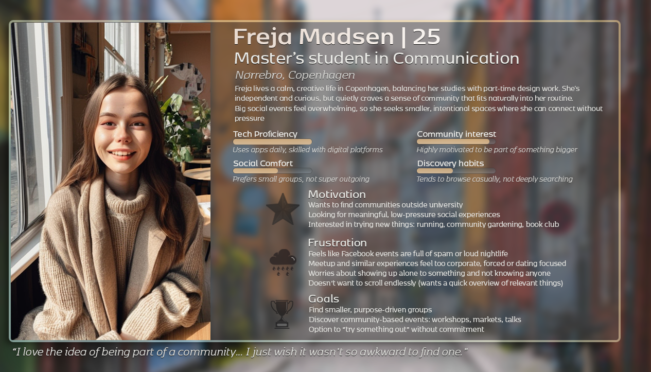
Freja was the first take of a persona who would benefit from the application.
She wants to meet new people without feeling lost online. She would like the ability to quickly browse events that suits her and feel safe meeting strangers.
User journey
User Journey (Before Samli)
| Stage | Action | Feeling | Pain Point |
|---|---|---|---|
| Awareness | Hears about clubs via poster | Mild interest | No details, no contact info |
| Search | Googles “aktiviteter i København” | Frustrated | Results are messy or outdated |
| Decision | Gives up or tries Facebook | Overwhelmed | Doesn’t like or trust the platform |
| Action | Doesn’t join anything | Isolated | Still interested, just stuck |
The friction, while not dramatic, it is subtle which adds up.
Expected User Journey (With Samli)
With Samli, the journey should be shortened and simplified:
Open App > Browse curated events > filter by interest > View clear event data > Decide
The aim would be, not to remove choice, but to remove uncertainty.
Ideation & UX flow
Concept/Low-fi
For smooth flow, I drew up sketches and low-fi wireframes early to quickly test ideas. Focus was simple navigation, filtering of interest and safe on-boarding.
The goal was intuitive flow for both new users and those with more technical finesse.
The priority was as follows: Event clarity, visual hierarchy and calm pacing.
Due to the app hopefully appealing to a broader generational audience, the app should avoid gamification and excessive notifications, favoring a more grounded feel.

Initial Draft for Prototype
The navigation is intentionally simple.
Bottom navigation bar supports: Event discovery, Saved Events, Profile.
Event cards emphasize: Imagery (Atmosphere), Time and location, Short readable descriptions.
Filters are present to sort by preference and interest: Help navigate relevancy quickly
Design Guidelines
Visual language aims to feel:
- Friendly but not childish
- Modern but not loud
- Neutral enough to support diverse cast of events
Soft color tones, generous spacing and clear typography help the interface breathe and UI that supports scanning rather than demanding attention.
Prototyping & Iteration
First user test of the prototype was conducted with five participants, who found the filter flow to be unclear. As result, a revisit was carried out in order to simplify labels and menu.
Reflections & Next Steps
Samli is a conceptual project, but reflects real design challenges.
What stood out to me the most was how small decisions, like spacing, wording or hierachy, would directly affect whether users feel confident or hesitant.
The project reinforced the importance of:
- Respecting user attention
- Thinking beyond screens and into behavior
If I was to allow myself further development time, I would have loved to expand testing phase with a broader Audience. Test alternative on-boarding approaches in A/B testing. Explore accessibility considerations more deeply. Experiment with location-based discovery.
Closing Thoughts:
Sali is not about events but about lowering threshold for participation.
This project allowed me to explore mobile UX design as a balance between structure and softness, logic and emotion. It reflects my broader design philosophy of more thoughtful, human-centered holistic design with real behavior.